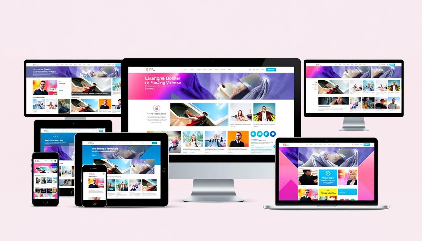
I help businesses succeed online with professional eCommerce website design and development. In today’s world, having a responsive website is key. It must work well on desktops, tablets, and smartphones. That’s why I focus on mobile-friendly design and responsive layouts.
More and more clients want websites that work on mobile devices. This shows how important responsive designs are. They make sure websites work well on all devices and screen sizes. This way, businesses can reach more people.
Introduction to Responsive Design
Technology keeps changing, and new devices keep coming out. It’s important to make websites that fit different screens and devices. I think responsive layouts and mobile-friendly design are vital for success online.
Key Takeaways
- Responsive website layouts are essential for businesses to achieve online success
- Mobile-friendly design is critical for a smooth user experience
- Responsive website layouts help businesses reach more people
- Using responsive layouts and mobile-friendly design boosts user experience and SEO
- Keeping up with the latest technology and design trends is vital for online success
Understanding Responsive Website Layouts
Responsive website design is all about making websites work well on any screen size. It uses fluid grid layouts and scalable web design to adjust content as screens change. This ensures a great user experience, no matter the device.
Media queries are key in responsive design. They let developers change styles and layouts based on screen size. This way, websites look good on both small and large screens, giving users the best experience.
Responsive design has many benefits. It makes websites more user-friendly, accessible, and engaging. This leads to higher user satisfaction and better results for businesses.
Recent data shows over 50% of website visits come from mobile devices. This makes responsive design even more critical. By using fluid grid layouts and scalable web design, we can make sure our websites work well on all devices.
By applying responsive design principles, we can make websites that look great and work well on any device. This approach ensures a top-notch user experience, no matter the screen size.
| Device Type | Screen Size | Responsive Design Approach |
|---|---|---|
| Mobile | Narrow-screen | Single-column layout |
| Tablet | Medium-screen | Multi-column layout |
| Desktop | Wide-screen | Multi-column layout with flexible grids |
Benefits of Responsive Website Layouts
As a web design expert, I know how great responsive layouts are. They make websites better for users. This is thanks to adaptive design and flexible web design. These designs make sure websites work well on all devices.
A good responsive website keeps people interested. It makes them want to see more. This leads to more people doing what you want them to do. Plus, websites load fast, which keeps users coming back.
Some big pluses of responsive layouts are:
- More people do what you want because your site works well on all devices.
- Users have a better time on your site because it adjusts to their screen.
- It’s cheaper to keep one site that works on all devices instead of many.
Did you know 53% of mobile users leave if your site takes more than three seconds to load? Also, a responsive site avoids problems with search engines. This is because it uses adaptive design and flexible web design.

In short, responsive layouts are a big win. They make websites better for users, help with search rankings, and save money on upkeep.
Key Principles of Responsive Design
Responsive web development is key for a user-friendly website. It makes sure your site works well on all devices. SEO-friendly design is also important for search engines and user experience. There are several key principles to follow.
These include fluid grids, flexible images, and media queries. These elements help your website adjust to different screen sizes. This gives your users the best viewing experience.
Fluid Grids
Fluid grids are vital for responsive design. They let your website change size based on the screen. Using relative units like percentages makes the grid adjust well.
Flexible Images
Flexible images are also key. Setting images to a maximum width of 100% ensures they fit their container. This prevents overflow or cropping.
Media Queries
Media queries are powerful in responsive design. They let you change styles based on screen size or resolution. This makes your website work well on different devices.
- Improved user experience
- Enhanced SEO performance
- Reduced maintenance costs
By using these responsive design principles, you can make a website that’s easy to use and search engine friendly. This is a strong base for your online presence.
| Device Type | Screen Size | Responsive Design Benefits |
|---|---|---|
| Mobile | 240px – 768px | Improved user experience, enhanced SEO performance |
| Tablet | 768px – 1024px | Reduced maintenance costs, increased engagement |
| Desktop | 1024px – 2000px | Enhanced SEO performance, improved user experience |
Best Practices for Creating Responsive Layouts
Creating a responsive website layout is key for a great user experience. It makes sure your site works well on all devices, like desktops, laptops, tablets, and smartphones.
A mobile-friendly design is vital. It lets users easily use your site on smaller screens. In fact, 57% of internet users won’t recommend a business with a bad mobile website. So, designing for mobile first is a must.
Here are some top tips for making responsive layouts:
- Use a fluid grid to make your site fit different screen sizes.
- Focus on content hierarchy to show the most important stuff first on smaller screens.
- Test your site on various devices to make sure it works for everyone.
By following these tips, you can make a responsive site that works well on all devices.

| Device | Screen Size | Percentage of Web Traffic |
|---|---|---|
| Desktop | 1920×1080 | 30% |
| Tablet | 1366×768 | 20% |
| Smartphone | 360×640 | 50% |
Common Frameworks for Responsive Design
Creating responsive website layouts is easier with established frameworks. They use fluid grid layouts and scalable web design to make sites friendly on all devices.
Frameworks like Bootstrap, Foundation, and Tailwind CSS are popular. They offer pre-built code and tools for responsive sites. For example, Bootstrap has a modular design for building responsive sites. It’s great for professional ecommerce website design and development.
Using these frameworks has many benefits:
- Less time and effort in development
- Better performance and responsiveness
- Improved user experience on all devices
Choosing the right framework is key to a responsive website. It boosts engagement and conversion. Whether it’s a new site or a revamp, using fluid grid layouts and scalable web design is essential today.
| Framework | Key Features | Benefits |
|---|---|---|
| Bootstrap | Modular architecture, real-time utilities, and themes | Streamlined development, improved performance |
| Foundation | Lightweight structure, easy integration | Faster development, enhanced user experience |
| Tailwind CSS | Customizable, responsive design | Improved performance, reduced development time |
Tools for Designing Responsive Layouts
Designing responsive layouts is key. As a pro, I know adaptive design and flexible web design are vital. With more people using mobiles, 54% of website traffic comes from mobiles by early 2023.
Designers use tools like Adobe XD, Figma, and Sketch for responsive layouts. These tools have features for different screen sizes. For example, Figma helps share designs in real-time and supports responsive design.
Using these tools brings many benefits:
- Improved user experience through responsive design
- Enhanced collaboration and prototyping capabilities
- Streamlined design process with pre-built templates and features
Designers can make websites that work well on all devices. With 3.4 connected devices per person, responsive design is critical.
Choosing the right tools and design approach helps businesses. It boosts user engagement, increases conversions, and keeps them competitive in the digital world.
Responsive Web Design and User Behavior
Understanding user behavior is key in responsive web development. With over 60% of visits on mobile devices, it’s vital to know how users interact on different devices.
Responsive web design can change how users behave. For example, it can increase page views by 25% on average.
When designing a responsive website, consider these factors:
- Fluid grids for different screen sizes
- Flexible images for proper scaling
- Media queries for layout based on screen size and orientation
By focusing on responsive web development, businesses can make an SEO-friendly website design. This design offers a great user experience on all devices. It leads to more engagement and conversions.
Challenges in Implementing Responsive Design
Creating websites for all devices comes with challenges. One big issue is making sure our site works well on mobiles. Over 50% of web traffic comes from mobiles. We must think about browser issues, performance, and design choices.
Browser compatibility is key. Older browsers like Internet Explorer 8 don’t support responsive design. We should focus on supporting browsers that most people use, avoiding very old versions.
Browser Compatibility Issues
To solve browser problems, tools like LambdaTest are helpful. They test on over 3000 devices, browsers, and OS. This helps us find and fix issues before they bother our users.
Performance Considerations
Ensuring our site works well on all devices is another challenge. Using percentage-based layouts helps. Also, optimizing images for slow connections can speed up our site and keep users happy.

By tackling these challenges, we can make websites that work great on all devices. For tips on speeding up your site, check out this resource. It offers advice on improving loading times and user experience.
Design Compromises
Responsive design often means making design choices. We might simplify menus or use flexible images. These choices help our site look good on any device, giving users a great experience.
Future Trends in Responsive Website Design
Looking ahead, responsive website layouts will remain key in making websites easy to use and accessible. With more people using mobile devices, fluid grid layouts will be vital. They ensure websites work well on all screens and devices.
Future trends include adapting for voice search, using AI and machine learning, and adding augmented reality. These will make websites more personal and interactive. This will highlight the role of responsive website layouts and fluid grid layouts even more.
Here are some key statistics that show why responsive design matters:
- 50% of internet users access websites via mobile devices as of 2023
- Websites with responsive design are 60% more likely to retain visitors compared to those without
- Adopting a mobile-first design approach can increase conversion rates by up to 27%
By using these trends and best practices, businesses can stay ahead. Whether big or small, investing in responsive website layouts and fluid grid layouts is essential. It helps provide a great user experience.
| Trend | Importance |
|---|---|
| Voice Search Adaptations | High |
| AI and Machine Learning Integration | Medium |
| Augmented Reality Experiences | Low |
Case Studies of Successful Responsive Designs
Looking at successful responsive website designs is key. These examples show us what makes a website work well on all devices. A good responsive website uses scalable web design and adaptive design to ensure a smooth user experience.
Some notable examples of successful responsive designs include:
- Retail websites: Companies like Amazon and Walmart have implemented responsive designs. This has led to higher conversion rates and more revenue.
- Informational websites: Sites like Wikipedia and BBC News use responsive designs. This makes it easy for users to find information on the go.
- Portfolio sites: Designers and artists have created responsive portfolio sites. These sites showcase their work in a beautiful and easy-to-navigate way.
These examples highlight the value of scalable web design and adaptive design. By using these principles, businesses can boost their online presence. This leads to more engagement and conversions.

By studying these case studies, we see the benefits of a responsive website design. Whether you run a retail site, an informational site, or a portfolio, a well-designed responsive website can help you meet your online goals.
Website Type Benefits of Responsive Design Retail Increased conversion rates, improved user experience Informational Easy access to information, improved search engine rankings Portfolio Visually appealing, easy-to-navigate, increased engagement
Conclusion: Embracing Responsive Website Layouts
In today’s fast-changing digital world, making websites responsive and
SEO-friendly
is key for businesses. With over 50% of web traffic coming from mobiles, it’s vital to have websites that work well on all devices.
Responsive website layouts make sure your site is easy to use for everyone. This approach improves user experience and helps with search engine rankings.
Responsive web development
also means people spend more time on your site. In fact, sites that are mobile-friendly see a 55% increase in time spent. Plus, going mobile-first can cut bounce rates by 30-50%.
Responsive design will keep being important for online success. I suggest checking out the many resources out there. Make your website responsive and
SEO-friendly
to attract more visitors and grow your business. Let’s make sure our online presence stays strong and flexible in the digital world.